Why shade still matters, even after the coffee brews
We’ve fitted a fair few luxury kitchens across Essex, and one thing keeps coming up in conversation: colour. Friends chat about appliances, builders talk square-metres, yet the hue on your cabinets does more of the emotional heavy lifting than anything else.
Walk into a Chelmsford extension painted a deep navy and you feel wrapped in warmth; step into a bright-white barn conversion in Manningtree and the room practically sings “good morning.” So, let’s spend a little time with five hues that pull their weight in an Essex-style upscale kitchen. Kettle on? Good… let’s wander through the palette.

1. Grey – cool as a sea breeze, yet grounded like Mersea mudflats
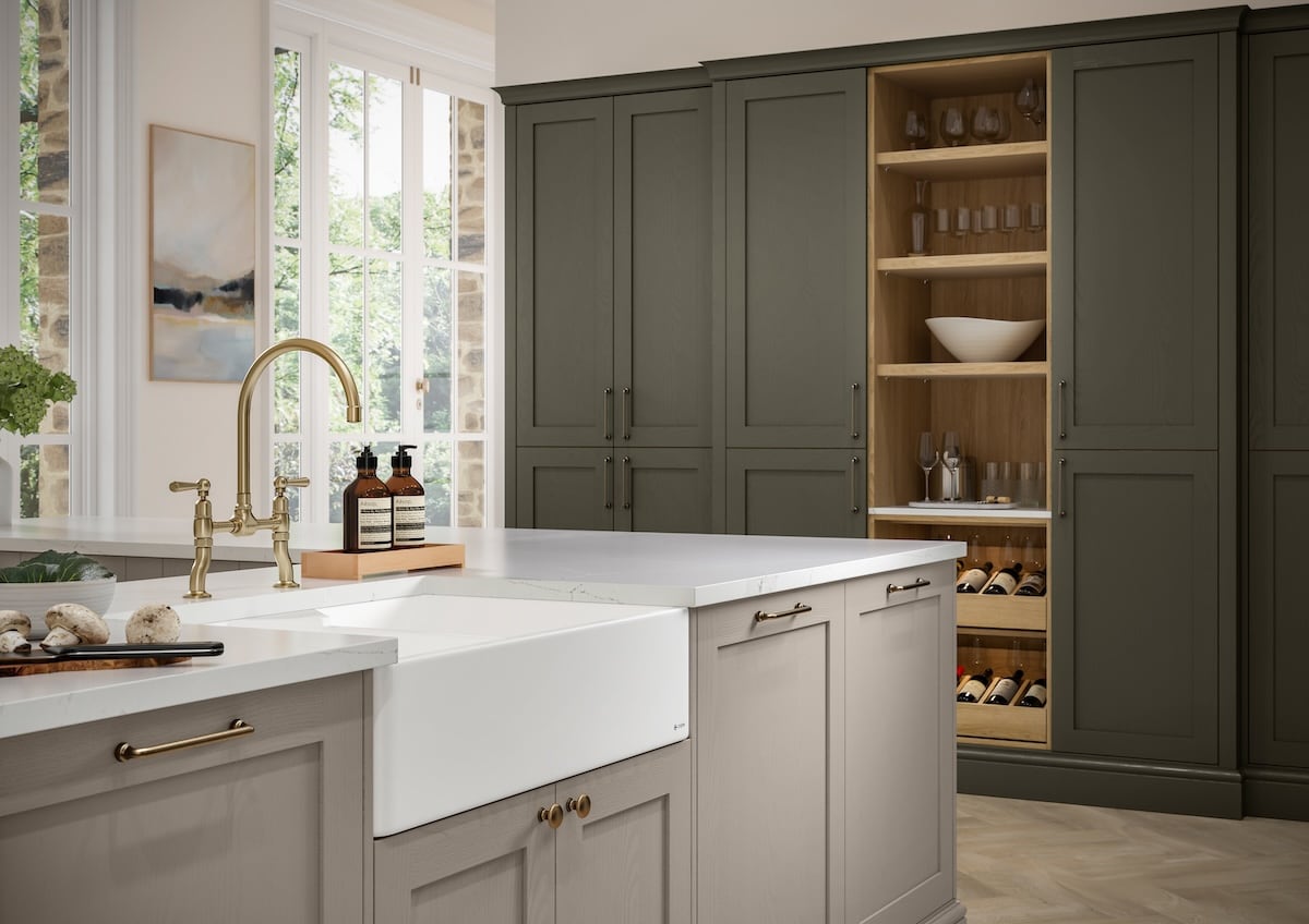
Grey isn’t new or flashy, and that’s exactly its magic. A pale dove shade loves the soft, diffused light we get on hazy mornings along the Blackwater Estuary. Charcoal, on the other hand, pairs beautifully with the black frames of those fashionable Crittall doors everyone seems to be adding.
We often layer greys. Upper wall units in a whisper-light tone, base cabinets just a shade or two darker, and maybe a smoky island at the centre. That subtle gradation keeps things interesting without shouting.
Wondering about handles? Satin nickel stays timeless, but a warm brass knob suddenly feels like a surprise espresso shot – bright, quick, and a little indulgent.
Let me explain one more quirk: grey reflects undertones around it. Pop in Carrera marble worktops and the grey cools down; introduce rustic oak shelves and the colour softens, almost to greige. It’s chameleon-like, and that adaptability is worth its weight in quarts.

2. Blue – from calm Cornflower to daring Midnight
Essex isn’t short on coastline, so blue naturally tugs at our hearts. Yet clients often ask, “Will it date?” Not if you pick wisely. A gentle cornflower, paired with crisp white walls, feels airy in a Leigh-on-Sea townhouse. Slide that slider to midnight navy and now you have theatre – picture recessed LED strips washing moody indigo across a fluted island while pendant lamps shimmer above.
Blue also hides a multitude of fingerprints, gravy splashes, and toddler fingerprints disguised as “art.” That makes it both stylish and forgiving, a double win. Try adding hammered copper handles or an antique brass tap – the contrast between cool blue and warm metal sparks energy, like fish and chips on a breezy pier.
A quick side note: open shelving painted to match your deep-blue base units looks gorgeous when you line it with white china. Think Hamptons style, but with better cheese from the local deli.

3. Black – the night sky over Dedham Vale
Black kitchens used to scare homeowners. “Too dark,” they’d say, picturing a gothic dungeon. Reality? Matte black absorbs glare, giving cabinets a silk-soft look. Paired with pale quartz worktops and under-cabinet lighting, the scheme glows instead of broods.
A few tricks keep black feeling high-end rather than heavy:
-
Texture – go for a ultra-matte or ‘super-smooth’ anti-fingerprint door.
-
Contrast – think white metro splashback or light ash flooring.
-
Accents – slimline brass rail on the island, perhaps a walnut breakfast bar cantilevered off the edge.
You know what? Black also photographs beautifully. Instagram loves it, which sounds trivial until you realise those progress pics sway friends and family who might, quite literally, eat at your island next Christmas.

4. Green – a nod to Essex countryside without the muddy boots
Drive from Braintree to Finchingfield in late April and you’ll see every shade of green: budding hawthorn, rolling barley, and those apple-orchard leaves. No wonder people crave that life-affirming hue indoors. Soft sage on Shaker doors feels calm and classic; venture deeper into forest green for a modern spin.
Green pairs effortlessly with warm metallics – aged bronze hinges, brushed brass taps – and with natural textures. When we recently installed a sage-green kitchen in Danbury, the client chose rattan stools and terracotta planters. The room felt like an alfresco brunch spot, minus the unpredictable drizzle.
Handy tip: watch your lighting. A north-facing galley can flatten green, making it read grey. Test large paint swatches under morning coffee light, afternoon school-run light, and late-night-raid-the-fridge light. You’ll thank us.

5. White – still the clean classic, but never boring
Some designers call white “safe,” yet safety can be luxurious. White boosts natural brightness, reflecting every drop of winter sun that squeezes through your bi-folds. It also stretches the sense of space, handy when your Galleywood kitchen still juggles laundry, homework, and Friday-night pizza prep.
To keep white interesting: texture, texture, texture. Picture satin lacquer doors, honed marble splashback, and knurled chrome handles. Small tonal shifts – ivory on cabinets, chalk on walls, pale smoke on plaster coving – create depth.
Worried about wipe-ability? High-quality lacquers shrug off turmeric splashes with a soapy cloth. And because white is basically Switzerland, you can switch fun accents each season: burnt-orange stools for autumn, pastel crockery for spring, navy linens for summer barbecues that drift indoors.
Little Nuggets of Practical Wisdom
We promised no endless lists, so just a sprinkling:
-
Sample big: Paint a full A4 board, not a tiny tester. Stick it beside your kettle and live with it for a week.
-
Mind the sheen: Gloss bounces light but reveals finger smudges. Suede-matte hides wear yet feels sophisticated.
-
Hardware harmony: Choose your tap and handles early; finish options mess with how pigments look.
-
Splash of personality: Inside larders or drawers, we sometimes lacquer a surprise colour. Open, smile, close – tiny joy.

Bringing Colour Home to Your Luxury Kitchen in Essex
Choosing between grey serenity, blue depth, black drama, green freshness, and white clarity isn’t about chasing trends. It’s about how you live – how you prep Sunday roasts, sip morning espressos, help with GCSE revision, or sneak into the fridge for leftover trifle.
Ask yourself: do you want your kitchen to calm the chaos or spark conversation? Maybe both. Whatever hue you lean toward, remember that top-notch cabinetry, expert fitting, and thoughtful lighting make the colour sing.
We’re here, in Colchester, cups of tea ready, to help Essex homeowners find the shade that tells their story... one perfectly painted door at a time.
Share: